

R56 Yay or Nay on stripes??? Already installed.

Yay or Nay on stripes??? Already installed.
Just wanted some opinions....
I had some extra vinyl laying around so I cut up some stripes. Not sure if I like them or not...
Opinions?
Before:
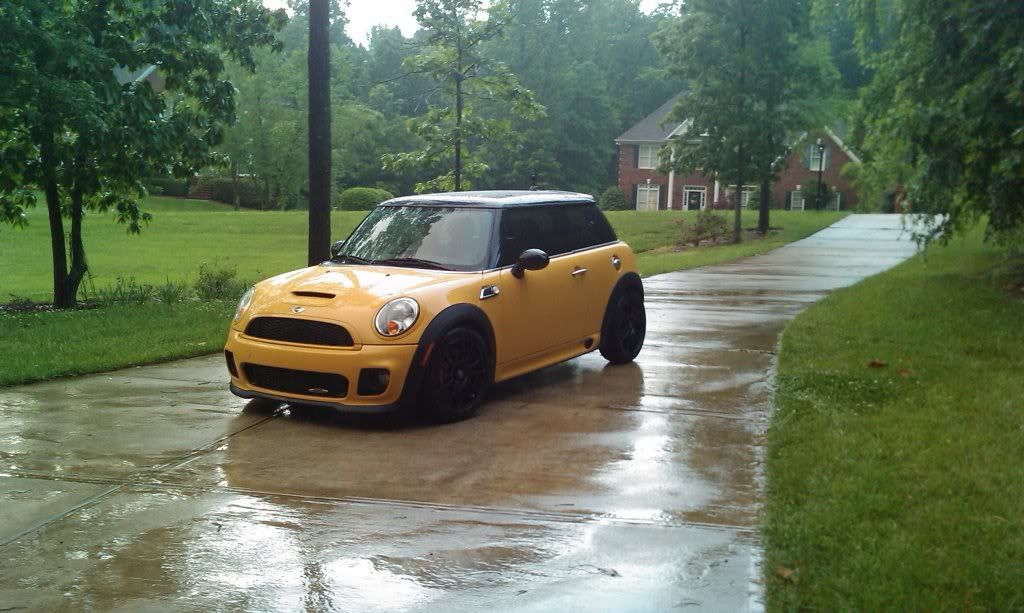


I had some extra vinyl laying around so I cut up some stripes. Not sure if I like them or not...
Opinions?
Before:


6th Gear
Joined: Mar 2007
Posts: 7,578
Likes: 5
From: Paradise
Sorry, doesn't do much for me.
Visually, it doesn't work for me (BFA in Fine Arts). It makes the front of the car look bare. If you like that graduated line motif, it needs to be mirrored in the front -- starting from the bar below the bottom grille, working up to the bottom of the scoop. The smaller lines would be at the scoop and the heavier lines on the bumper.
Also, it doesn't evoke any of the heritage of racing stripes, so it is just a decoration. I'm biased, but I think your car would look great with this stripe:
Trending Topics


I like it, but try to see what it might look like below the scoop too. ie continue the small strips below the scoop and around the mini logo. possibly down the front bumper as well.... just a thought.


2nd Gear
Joined: Dec 2006
Posts: 142
Likes: 0
I like the look on your car. It is a very unique touch to a very unique piece of art. I am curious to see what the black scoop looks like. I am driving my 2nd MINI-an 08 Clubman S. I removed the original stripes and put on stripes that I liked. Probably no one notices. I did it because I like it. Enjoy the Uification.


It's interesting, but I'm not a fan. I'd agree with the posters above that it should be continuous down the front of the car. Maybe have more rhythm in the spacing as well or more spacing between the vinyl?

4th Gear


Joined: Sep 2007
Posts: 336
Likes: 8
From: Falls Church, VA
That is a hot design but I'm also of the group that thinks it needs to continue down past the scoop. Somehow it does look 'kind of bare' from the scoop down. However I see the pain in the *** logistics of doing that.

S*T*R*I*P*E*S!!!!! You and I have already discussed the "complete" look - and just about everybody here seems to agree. Let's see it with the blacked out scoop, and see if that helps... OH, and guess what I got today!?

6th Gear
Joined: Oct 2007
Posts: 27,997
Likes: 0
From: Phoenix, AZ

6th Gear
Joined: Mar 2007
Posts: 7,578
Likes: 5
From: Paradise
If you black the scoop, you would definitely need to turn the design around with solid at the scoop, and fading at the windshield.
Also, the progression needs some work. Just before it hits the solid black, the stripes become fairly similar in width for awhile, then boom, all black. It should be a mathematical progression. Something like each stripe being 125% as wide as the one preceding it.
Even with a black scoop, I think you would need something to balance it on the bumper. I'm not sure what.
6th Gear
Joined: Jan 2008
Posts: 1,103
Likes: 0
From: Phoenix AZ

actually it would have looked real nice if you had the scoop black and turned the stripes around to have the thicker block start at the scoop.
Oh, does that thing got a HEMI?
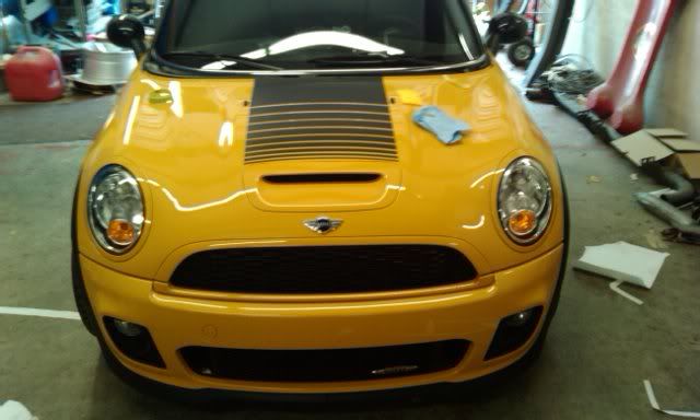
Thanks guys (and girls  ) I appreciate the opinions. I did do this tonight.

Instead of doing the entire scoop, I did just the outline. I already removed the stripes and will try again tomorrow. I agree, the stripes will look better starting thick and fading off to nothing.
As far as the progression of the stripes, help me out. All I did was keep making each strip 1/4" wider than the previous. There was a 1/4" space between each stripe.
Should there be more stripes, each one progressively wider (like Robin mentioned...125% of the previous stripe)
Should the spacing be kept at 1.4"?
Keep the suggestions coming.
Lemme guess.... you got your stripes in? So when you coming to see me?
Mark
) I appreciate the opinions. I did do this tonight.Instead of doing the entire scoop, I did just the outline. I already removed the stripes and will try again tomorrow. I agree, the stripes will look better starting thick and fading off to nothing.
As far as the progression of the stripes, help me out. All I did was keep making each strip 1/4" wider than the previous. There was a 1/4" space between each stripe.
Should there be more stripes, each one progressively wider (like Robin mentioned...125% of the previous stripe)
Should the spacing be kept at 1.4"?
Keep the suggestions coming.
Lemme guess.... you got your stripes in? So when you coming to see me?
Mark

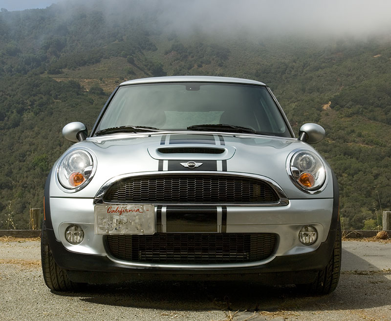
I think the stripe spacing and size should change. Spacing should get smaller while the stripe gets thicker. Check out this:
http://www.stencilsandstripes.com/im..._hoodbulge.jpg
I think that looks right.
http://www.stencilsandstripes.com/im..._hoodbulge.jpg
I think that looks right.


4th Gear
Joined: Jun 2008
Posts: 501
Likes: 0
From: Charlottesville, VA
I agree with the assessment that if the hood scoop is black, then the stripes should fade up the hood instead of down. I also think you need to work on the arc of the stripes to they mirror the shape of the hood scoop. If you just cut straight lines, then when its laid over the hood, it arcs on it's own and messes up the lines.
Also, coyle996's suggestion is right on. When you decrease the thickness of the stripes, increase the space. And remember, it may not necessarily be a calculation as much as just seeing what suits your eye. When you find it, you'll know.
Also, coyle996's suggestion is right on. When you decrease the thickness of the stripes, increase the space. And remember, it may not necessarily be a calculation as much as just seeing what suits your eye. When you find it, you'll know.