
What is the Lowcountry?

Thread Starter
|
Minty Fresh
Joined: Apr 2003
Posts: 411
Likes: 0
From: Charleston, SC
What is the Lowcountry?
I'm working on a motoring badge for the club and I want some input from you lot.
What symbolizes the Lowcountry or Charleston to you guys?
Difficulty: No Bridge (it's been done & I've got one already), No Rainbow Row
Aaaaaaand Go!
What symbolizes the Lowcountry or Charleston to you guys?
Difficulty: No Bridge (it's been done & I've got one already), No Rainbow Row
Aaaaaaand Go!


I realize the geometry.....The bridge would have to be different...it's just that there are no MINI's on the badge.
Trending Topics

the badge would be on a mini, people might get the connection.

4th Gear
Joined: Aug 2007
Posts: 453
Likes: 1
From: charleston,sc
Looks very nice.......but I personally think the new bridge and Charleston have been waaay over done together. Probably because of where I work I see it on alot of stuff(commerative coins,masthead,posters,shirts,etc. ad naseum) To me the "LowCountry" is more marshes, shrimp boats, cast netting from a dock; not just Charleston scenes because technically the LowCountry is all the way down past Beaufort.
Thread Starter
|
Minty Fresh
Joined: Apr 2003
Posts: 411
Likes: 0
From: Charleston, SC
Looks very nice.......but I personally think the new bridge and Charleston have been waaay over done together. Probably because of where I work I see it on alot of stuff(commerative coins,masthead,posters,shirts,etc. ad naseum) To me the "LowCountry" is more marshes, shrimp boats, cast netting from a dock; not just Charleston scenes because technically the LowCountry is all the way down past Beaufort.


5th Gear
Joined: Sep 2006
Posts: 749
Likes: 1
From: Lexington, SC
Lowcountry S is right. Marsh or Shrimping, maybe even a shrimp, crab or something along those lines. . bridge is nice but its so over used.
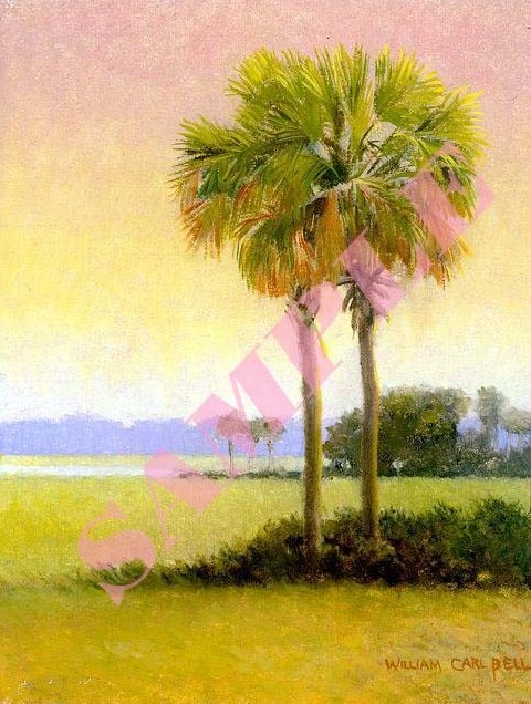
Palmetto tree fo' sure
How bout something like this
I can do a vector for you if you like. Thats my expertise. It would be something like above but not the same.
Blue is good for color, maybe red, not sure. I would keep it monotone though.
I guess all these ideas are what happens when you look at print all day


4th Gear
Joined: Aug 2007
Posts: 453
Likes: 1
From: charleston,sc
I like it alot!, but want to see it in another font also. Something a little less phat, not too much, but just enough for a little more definition would look very cool indeed I think. Love the transparent middle idea!!


Thread Starter
|
Minty Fresh
Joined: Apr 2003
Posts: 411
Likes: 0
From: Charleston, SC
That's actually the look I was going for, but you're right. Something felt off while I was making it and I couldn't figure out what it was... I guess that's it. The PSD has atleast 5 different text versions.
Any favorite fonts? My favorites are all too scripty to use in this application.
Thread Starter
|
Minty Fresh
Joined: Apr 2003
Posts: 411
Likes: 0
From: Charleston, SC
v2.0

3rd Gear
Joined: Jan 2007
Posts: 239
Likes: 0
From: Pawling, NY
like i said, that probably doesnt help much
