
Which one do you like better?


Thread Starter
|
6th Gear
Joined: Jun 2006
Posts: 5,692
Likes: 2
Which one do you like better?
I'm messing around with some designs for a shirt I can wear while "out motoring" in Fiona and I've hit an impasse... 
Which lettering seems best? One is more "retro" but the other is tougher. The car design is exactly the same in both cases - just the lettering is different.
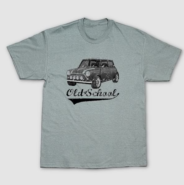
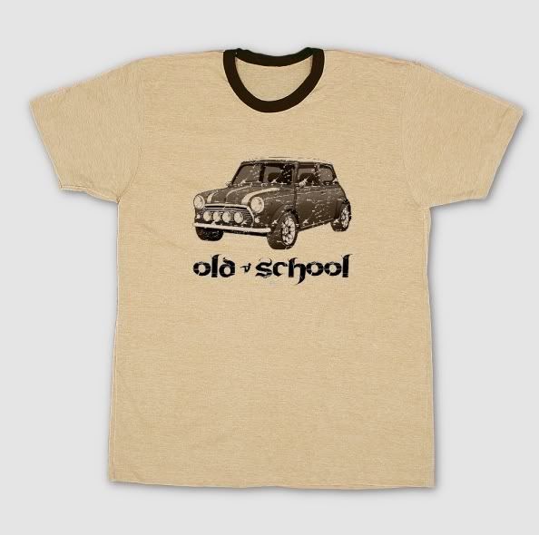
Which lettering seems best? One is more "retro" but the other is tougher. The car design is exactly the same in both cases - just the lettering is different.


Thread Starter
|
6th Gear
Joined: Jun 2006
Posts: 5,692
Likes: 2
I can use any shirt color, BTW... I just used different ones for contrast. I made graphics in red, blue, brown, green and black, since I don't have any idea yet if I'll just be making one shirt for me or ones for the wife and kiddie too (and if so, what they'll like). Easier to make multiple iterations all at once, y'know, rather than going back in and trying to replicate what I did after the fact... 


Trending Topics


6th Gear
Joined: Mar 2006
Posts: 1,114
Likes: 0
From: Kansas City
Hey Matt,
Love the grey. I agree with Irieman regarding font on yellow "not" old school. Sign me up for a grey one. Also, fwiw, it might be cool to scale down the whole thing and do a couple shirts with just a small logo where a pocket is generally located... or do the large one on back and repeat w/the smaller version on the frontside.
Love the grey. I agree with Irieman regarding font on yellow "not" old school. Sign me up for a grey one. Also, fwiw, it might be cool to scale down the whole thing and do a couple shirts with just a small logo where a pocket is generally located... or do the large one on back and repeat w/the smaller version on the frontside.
Last edited by dimini; Jul 27, 2007 at 09:55 AM.
Thread Starter
|
6th Gear
Joined: Jun 2006
Posts: 5,692
Likes: 2
Sorry guys - I'd LOVE to sell these to people, but I did not do the illustration of the Mini - it was done by COOPERation and I don't want to tick him off. Maybe this will give him an idea though - last I heard he could make t-shirts at his graphics shop, and he could probably do it cheaper than I do at Zazzle.com.
Thanks for the ideas though - I'm pretty partial to the true "old school" text, but it IS a bit more "cute"... After hearing that word 9 times a day when I drive around, I'm tempted to go "tough" if you know what I mean.
EDIT: Oooh - it's fun in ladies' style and green...
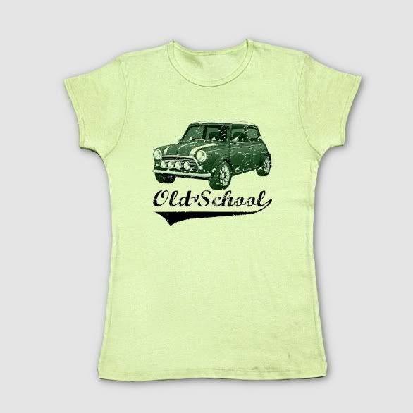
Thanks for the ideas though - I'm pretty partial to the true "old school" text, but it IS a bit more "cute"... After hearing that word 9 times a day when I drive around, I'm tempted to go "tough" if you know what I mean.
EDIT: Oooh - it's fun in ladies' style and green...
Last edited by ImagoX; Jul 27, 2007 at 10:36 AM.


Thread Starter
|
6th Gear
Joined: Jun 2006
Posts: 5,692
Likes: 2
OK, make your own shirt. 
This is the graphic I have. BTW - the arches are City arches, not Sportpack. The original image is in my sig. Maybe I can slap some exterior door hinges on it. Oh, wait, I don't want to do that - it looks like my car as it is!
This is the graphic I have. BTW - the arches are City arches, not Sportpack. The original image is in my sig. Maybe I can slap some exterior door hinges on it. Oh, wait, I don't want to do that - it looks like my car as it is!

6th Gear
Joined: Dec 2002
Posts: 1,539
Likes: 0

City arches, uhm that'd make it eighties "old school" ....

it's a cool shirt anyway...

