
MINI Software support!!


4th Gear
Joined: Aug 2007
Posts: 326
Likes: 0
From: OC,CA
Really? I find it very natural, just like reading a real map. Having them all horizontal makes it very hard for me to determine which street they are associated with.

Thread Starter
|
6th Gear
Joined: May 2006
Posts: 1,428
Likes: 1
From: Long Island, NY
Hmmmm..... now that you mention that, my chartplotter on my boat (GPS navigation on my boat) usee to show text oriented in the direction of the item, and it is VERY difficult to read. In fact, I wrote emails to Raymarine (the manufacturer) asking them to add an option to show the text straight. They did, and that is how I leave the option now. Didn'nt even think of that.
I personally think the text direction isn't the problem, it is the size of the display. I would love to see MINI remove the speedo, and just make that entire center area a much larger display. And make it touch screen while your at it. Can they make THAT change with software??


OVERDRIVE
Joined: May 2005
Posts: 8,233
Likes: 127
From: San Francisco
The readability of the text depends on the screen resolution and text rendering algorithms. It is possible to rotate text to different angles while keeping it just as readable. However, without antialiasing algorithms or with low resolution, rotated text can become jagged and hard to read. On my R52 factory Nav, rotated text can be jagged but still good enough that it is better than having everything horizontal. The R56 screen looks to be higher resolution (or the text rendering algorithms are better) and I think rotated text should be fine if they do a good implementation.
Touch screen would have been very useful in my 1st gen Nav unit. The basic problem is the awkwardness of navigating through a screen. Some screens actually have buttons drawn on them as though they were designed for a touch screen. That is the wrong design when there is only a single twirly **** for user input. It would have been okay if they designed the interface specifically to work optimally with the **** button.
Touch screen would have been very useful in my 1st gen Nav unit. The basic problem is the awkwardness of navigating through a screen. Some screens actually have buttons drawn on them as though they were designed for a touch screen. That is the wrong design when there is only a single twirly **** for user input. It would have been okay if they designed the interface specifically to work optimally with the **** button.
Thread Starter
|
6th Gear
Joined: May 2006
Posts: 1,428
Likes: 1
From: Long Island, NY
Touch screen would have been very useful in my 1st gen Nav unit. The basic problem is the awkwardness of navigating through a screen. Some screens actually have buttons drawn on them as though they were designed for a touch screen. That is the wrong design when there is only a single twirly **** for user input. It would have been okay if they designed the interface specifically to work optimally with the **** button.

I have a $3000, top of the line Alpine Navigation unit installed in my truck, it is touchscreen. Although it is VERY easy to use (very intuitive), the one problem I have with it are the buttons which are diaplayed(to be "touched"), are tiny most of the time, while the entire rest of the screen is blank. I don't understand that, you have a 7" by 5" screen, USE IT!!! I have two choices, YES or NO, and they put two little tiny Yes/No buttons at the bottom of the screen, right next to each other. Stupid.
Is that what you were trying to point out with touchscreens?
OVERDRIVE
Joined: May 2005
Posts: 8,233
Likes: 127
From: San Francisco
It's sort of like if your mouse stopped working, you can still operate most applications awkwardly using a keyboard alone. It's that kind of awkwardness I feel when I try to operate my Nav. It could have been better with some creative user interface design.
OVERDRIVE
Joined: May 2005
Posts: 8,233
Likes: 127
From: San Francisco
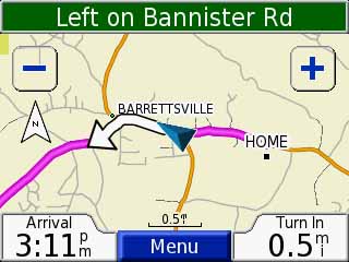
When I wrote earlier that street names can look jagged when displayed at an angle, I must have been thinking of one of the Internet map services. As you can see below, the text on my 1st gen MINI Nav is very readable at all angles.
So back to the question of street names horizontal vs on the angle of the street. This is what 800 and 400 ft maps look like in San Francisco. I challenge you to imagine the labels being only horizontal on these maps and whether it would be decipherable at all (even in the 400 ft scale).
Hey, you can see the Lombard crooked street here!
Last edited by rkw; Oct 4, 2007 at 12:48 PM.
4th Gear
Joined: Aug 2007
Posts: 326
Likes: 0
From: OC,CA
Thanks RKW for posting those. It's baffling to me why some folks think all horizontal names are better. I have no trouble at all reading those angled names (no head turning required), and it's crystal clear what street they refer to.

4th Gear
Joined: Sep 2007
Posts: 479
Likes: 0
From: Seattle

 (need wifi and all)
Thread Starter
|
6th Gear
Joined: May 2006
Posts: 1,428
Likes: 1
From: Long Island, NY
Nobody is saying "they are better". I am just "mentioning", that on my boat, the sideways names are VERY difficult to work with. I would like the option of either, that would be best.
4th Gear
Joined: Aug 2007
Posts: 326
Likes: 0
From: OC,CA
 Anyhow, sure, having both options would be best.
OVERDRIVE
Joined: May 2005
Posts: 8,233
Likes: 127
From: San Francisco
How is the screen resolution on your boat compared to the MINI? That makes a big difference on the success of text drawn at angles.
Thread Starter
|
6th Gear
Joined: May 2006
Posts: 1,428
Likes: 1
From: Long Island, NY
The screen resolution on my boat is MUCH better than the mini. It's a 10" 1028 screen, basically like a computer monitor. It just gets to busy sometimes with the text sideways.
In either case, thye certainly can imrove the mini method which is less than desireable.
In either case, thye certainly can imrove the mini method which is less than desireable.

OVERDRIVE


Joined: Aug 2006
Posts: 7,201
Likes: 8
From: Norfolk, VA
I've also noticed that the number of colours that the screen displays can make a *huge* difference in the perceived resolution of the screen. Here's a screenshot of my old Garmin 276c:

And here's a screenshot of the Garmin Nuvi:
Both screens are about the same size (3.75" diagonal for the 276c, 3.5" diagonal for the Nuvi 350).
But, the 276c has 320 * 480 resolution, which is DOUBLE the resolution of the Nuvi 350 (320 * 240).
So why does the Nuvi screen look so much better, with almost no "jaggies" on the text, and a smoother, more-detailed appearance overall? It's because the Nuvi display can show 65,536 colours, while the 276c is limited to only 256 colours. The extra colours on the Nuvi allow the display to perform "anti-aliasing", where it "blurs" the interface between a line and the background by using several different colours to gradually transition from the object colour to the background colour, rather than a sharp transition from foreground colour to background colour.
You can do the same thing with digital photographs. Take a picture, and save it as a 256-colour .GIF or JPG. The resolution will still be exactly the same, but the 256-colour version of the picture will look like crud.

Thread
Thread Starter
Forum
Replies
Last Post